


24i grew immensely in the last couple of years. Firstly 24i acquired Czech HbbTV app agency Mautilus, then Dutch media technology provider Stream One and finally itself became a daughter company of Amino Communications. What a huge change! It means more different people, more countries to conquer, and more opportunities! Lately, the company has expanded our portfolio of products and solutions to help our clients and partners grow even more and give them more possibilities. So, there is no better time than now to change the image of the business as well.

Our mission is to find the best solutions for our clients and connect our partners and work together with one goal — to make the video streaming services even more successful!
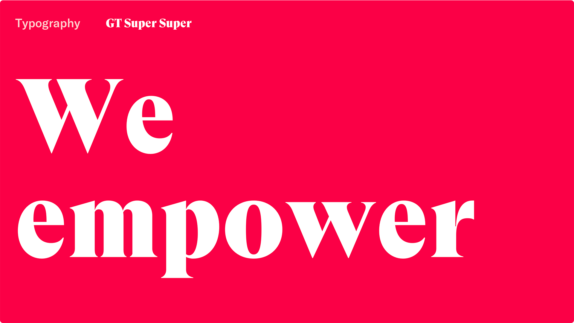
We empower, advise, nurture, connect and create new opportunities, we are challenging new technologies every day and lead the community by example. We are here to provide next-generation video experiences. We are here today, we will be here tomorrow. Let’s discover the future of video streaming together.
The main question was how we can create a flexible yet coherent brand system that transforms 24i from cold technology company to a bright leading brand in our industry. With this growth and big plans for the future new house style provides you with the look and feel that we care about every our product, that we are passionate about what we do on a daily basis, that we want to inspire you as well and share our emotions with you — with our colleagues, clients, and partners all over the world.
The other sort of such called sub challenge was that we had to communicate with different audiences in plenty of different environments – whatever design language we develop we need to translate in digital media, print, in physical spaces, independently or with our partners, and so on. The system should be easy to use and create assets and deliverables quickly.

The first thing we did – we just shifted the signature 24i red color to the vivid version – Crimson. Together with vibrant Crimson, we have four other colours – cool dark-green-blue Peacock, lively Peach, tender, soft Prawn, and dusty blue Mist. It is a brand new start – more creative and more playful. Each colour has a job. Primary tints Crimson and Peacock help to quickly identify a brand. You will be amazed at how high-contrast they are against a clean white! They can be matched with all secondary colours or used monochrome.
When it comes to secondary colours they should complement your primary shades in a way that achieves function without having them compete for attention. Just highlight and compliment the primary ones. These tones can also serve as good background colours, as alternatives to white.

The motif of the basic polygon shapes used throughout the branding identity is clean and simple - it is just the enlarged sections of our signature hexagon: 1 side or two sides with an angle. This pattern is easy to use in all kinds of mediums: from printing materials and interior design to digital.
One of the things that we ultimately love about the design system - we are a tech company that’s constantly evolving and the needs of our marketing department growing as well. So we have to deliver things quickly and this solved a major problem for us - we can actually create assets from nothing just using new fonts and patterns with a limited variety of colours.

For new branding was crucial to find very special fonts, a visual allegory of connection. When it feels like not a common tech company, but craftsmanship, creativity, and trustworthiness. Something unexpected. Like GT Super. This highly unique typeface is optimized for larger sizes and this is a very important point for us because we wanted to make our typography as loud as possible. That’s why having in the spectrum of font styles the extreme like hefty Super was a huge plus. We can use it in flashy headlines providing dynamic, fierce, and consistent expression. And together with our colours it feels very personal triggering the emotional response of your audience. Gt Super we balanced with GT America. It is the perfect match! The versatile system consists of eighty-four styles across six widths and seven weights which gives plenty of opportunities to use. By tweaking, twisting, and fine-tuning both our signature fonts, we can represent our business as multifaceted one being official or playful, fun and serious, powerful or sensitive.