


From the two cellists who took up the challenge at the time, Muziek aan Bed has now grown into a team of twelve cellists. They play in hospitals and care facilities, for children, adults, and people with dementia. The repertoire is constantly expanding so that the cellists can always adapt their choice to the situation. A crazy song for a group of children, a calm melody for someone who is very ill - the cellists sense what is possible. They play by heart what the heart tells them to do.
Usually, there is no budget for high-quality design in charity organizations and it is totally understandable. But in Belly&Brain we understood the importance of helping the community if we can and it was a lot of fun for me! I am glad to see how bright and inspiring the fond's look and feel became with a new identity!
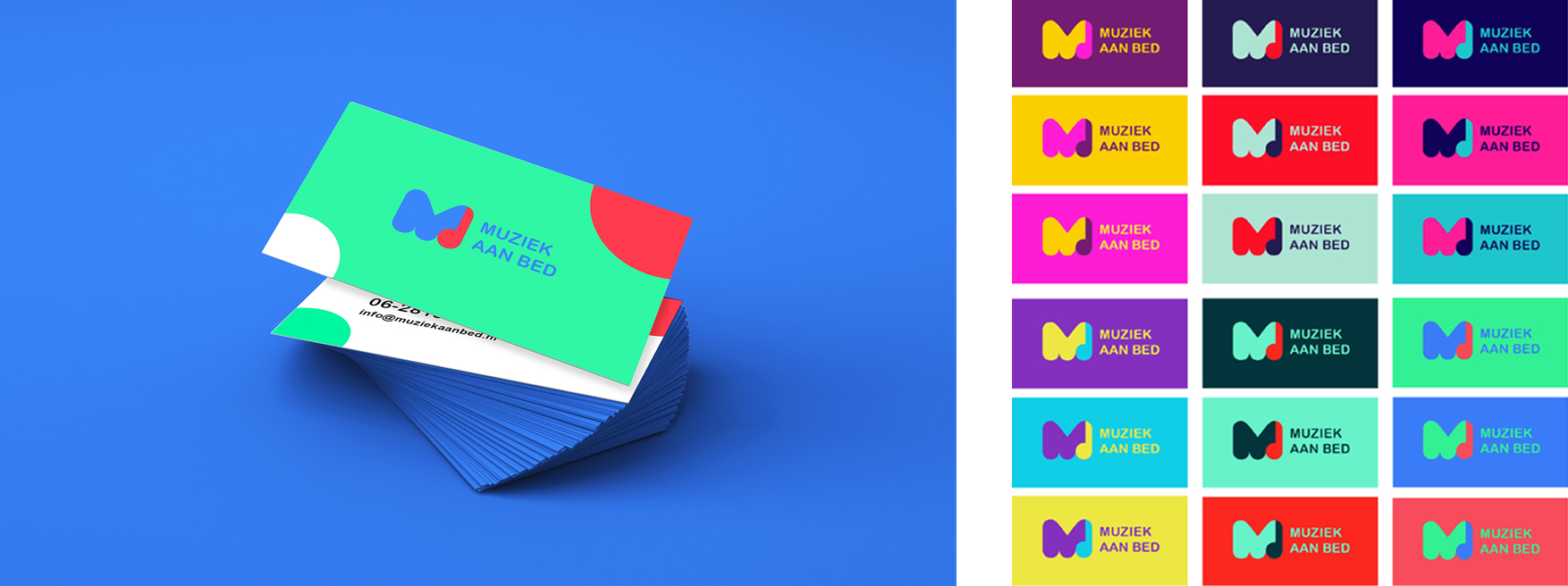
I tried plenty of log variants and found the one combining M and note - just perfect. But what shall we do with colours? The answer and inspiration I found in Holland Festival's flags - you haven't to stick to one, two three colour combinations, you can go wild and have more! As our emotions, they have plenty of options and it will allow you to refresh print and digital materials more often and house style will stay always fresh effortlessly.
I decided to bring more emotions and movement to the images for the fond with patterns from the equalizer's music waves to big circles from the note's base. All visual elements are very smooth and playful and work with photography very well. These mages catch your eyes, evolve warm feeling and excitement, and trigger to donate to make people in hospitals a little bit better.
And thanks to these kinds of projects I feel I can help people too.
